


Can we talk about something that’s been on my mind lately? I keep seeing SO many gorgeous websites that are basically the digital equivalent of a really pretty vase with no flowers in it. Like, they’re stunning to look at, but they’re not actually doing anything for the business. And honestly? It breaks my heart a little bit because I know how much time, energy, and money went into creating something that looks amazing but isn’t working nearly as hard as it should be.
Here’s the thing that might surprise you: strategy beats pretty every single time.
I know, I know. That probably sounds crazy coming from someone who designs websites for a living! But stick with me here, because this shift in thinking is going to change everything about how you approach your online presence.
The Pretty Website Trap (And Why We All Fall Into It)
Let me paint you a picture. You’re scrolling through Instagram (as one does), and you see this absolutely stunning website featured in someone’s stories. The colors are perfect, the fonts are dreamy, and everything looks so cohesive and Pinterest-worthy. You screenshot it immediately and think, “THAT’S what my website needs to look like!”
But here’s what we don’t see behind that gorgeous screenshot: Is that website actually converting visitors into paying customers? Is it clearly communicating what the business does and why someone should care? Does it make it stupidly easy for people to work with that business owner?
The truth is, most of the time, we have absolutely no idea. We just know it looks good.
And look, I’m not saying aesthetics don’t matter – they absolutely do! First impressions are real, and people do judge books by their covers (even though we’re told not to). But when aesthetics become the only focus, we end up with websites that are all style and no substance.
It’s like going on a date with someone who’s gorgeous but has nothing interesting to say. Sure, you might stick around for the appetizer, but you’re probably not calling them back for a second date.
What Web Strategy Actually Means (Spoiler: It’s Not Just Picking Colors)
Okay, so what do I mean when I say “web strategy”? Because I feel like that term gets thrown around a lot without people actually explaining what it is.
Web strategy is essentially the why behind every single decision on your website. It’s understanding your people so deeply that you know exactly what they need to see, when they need to see it, and how they need to see it in order to feel confident enough to work with you.
It’s asking questions like:
- Who is actually visiting my website, and what are they thinking about when they land here?
- What problem are they trying to solve, and how do I position myself as the solution?
- What questions are popping up in their minds as they scroll, and am I answering them before they even have to ask?
- What action do I want them to take, and am I making it crystal clear how to do that?
See the difference? Pretty is about how something looks. Strategy is about how something works.
The “Someone Cute and Fun” Problem
Let me tell you about something I see ALL the time. I’ll ask a business owner, “Who’s your ideal client?” And they’ll say something like, “Oh, someone who’s cute and fun and loves good vibes!”
And like… okay, I love good vibes too! But that description could literally apply to millions of people. It tells me nothing about what those people actually need from you or why they would choose you over the hundreds of other “cute and fun” service providers out there.
Here’s what I wish more business owners understood: your ideal client isn’t just a personality type or an aesthetic. They’re a real human being with real problems, real desires, real fears, and a real life that they’re trying to make better somehow.
When you really understand your people – I’m talking about their 3 AM worries, their biggest dreams, the thing they complain about to their friends – that’s when you can create a website that speaks directly to their soul.
For example, instead of targeting “someone cute and fun,” what if your ideal client was actually:
- A creative entrepreneur who’s been DIY-ing everything in her business and is finally ready to invest in professional help, but she’s terrified of being judged for not having it all figured out yet
- A busy mom who started a side hustle that’s actually taking off, but she feels guilty about spending money on herself and needs to feel confident that this investment will actually pay off
- A service provider who’s great at what she does but feels like she’s the world’s worst salesperson and just wants someone to help her communicate her value without feeling icky
See how much more specific and human those descriptions are? When you know your people at this level, you can create a website that makes them feel seen, understood, and excited to work with you.
The Less Is More Revolution (AKA Stop Bombarding Your Poor Visitors)
Can we talk about something that’s been driving me absolutely bonkers? The tendency to throw EVERYTHING onto a website because “what if they want to know about this too?!”
Here’s the thing: your website visitors are not there to read your autobiography. They’re not there to learn about every single service you’ve ever offered or every random thought you’ve had about your industry. They’re there because they have a problem, and they want to know if you can solve it – quickly and clearly.
This is where the magic of “less is more” comes in. And I’m not just talking about minimalist design (though that can be beautiful too). I’m talking about being intentional about every single piece of content on your site.
Every headline, every paragraph, every image should serve a purpose. It should either:
- Help your visitor understand what you do
- Build trust and credibility
- Address a concern or objection they might have
- Guide them toward taking action
If it doesn’t do one of those things, it probably doesn’t need to be there.
I know this can feel scary! What if you take away that paragraph about your dog and it was the exact thing that would have convinced someone to work with you? But here’s the reality: people’s attention spans are shorter than ever, and decision fatigue is real. The more options and information you give someone, the more likely they are to just… leave.
Think about it like this: if you walked into a restaurant and the menu had 847 items on it, how would you feel? Probably overwhelmed and maybe a little suspicious about whether they can actually do all of those things well. But if you walked into a restaurant with 12 carefully curated items, you’d probably feel confident that they know what they’re doing.
Your website should be like that second restaurant.
The Questions Your Website Should Be Answering (Before Anyone Has to Ask)
One of my favorite ways to think about web strategy is like being a really, really good host. You know how some people are just naturally amazing at hosting parties? They think about everything their guests might need before the guests even realize they need it. The bathroom is stocked with extra toilet paper, there’s a coat closet right by the door, and there’s always a drink waiting for you the second you walk in.
Your website should be like that amazing host, but for your potential clients.
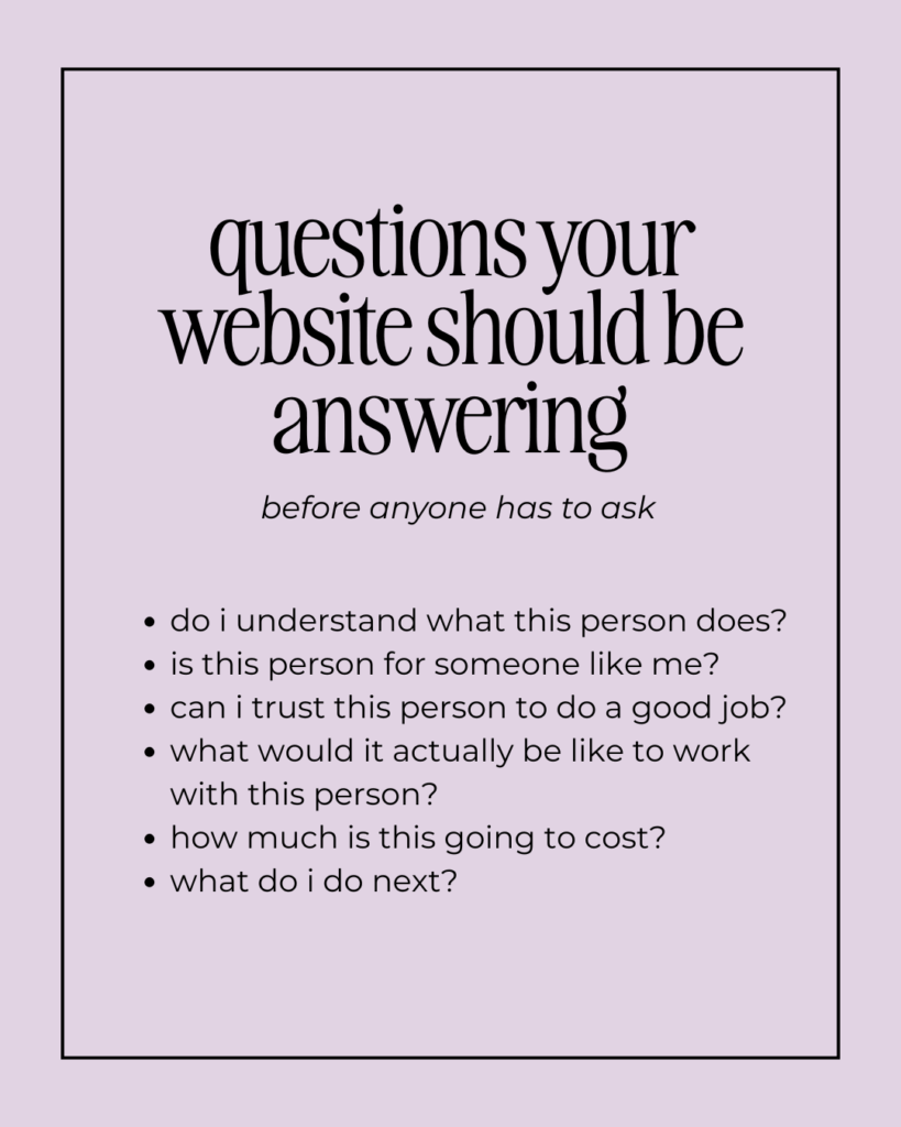
Here are the questions that are probably running through your visitors’ minds (consciously or subconsciously) when they land on your site:
“Do I understand what this person does?” This should be crystal clear within the first few seconds of landing on your homepage. Not in a boring, corporate way, but in a “oh my gosh, this is exactly what I need” way.
“Is this person for someone like me?” People need to see themselves reflected in your messaging, your imagery, and your client stories. They need to feel like you get them and their situation.
“Can I trust this person to do a good job?” This is where testimonials, case studies, your about page, and your overall professionalism come into play. People need to feel confident that you know what you’re doing.
“What would it actually be like to work with this person?” Paint them a picture! What’s your process like? How do you communicate? What can they expect? The unknown is scary, so make it known.
“How much is this going to cost?” Look, I get it. Pricing can be complicated, and you might not want to put exact numbers on your website. But people need at least a ballpark idea so they can self-select in or out.
“What do I do next?” This is the big one! If someone is convinced that they want to work with you, what’s the next step? Make it obvious, make it easy, and make it appealing.
Why Most Websites Fail at Strategy (And It’s Not Your Fault)
Here’s something that might make you feel better: most business owners have never been taught how to think strategically about their websites. You’re not born knowing this stuff!
Most of us approach our websites the same way we’d approach a brochure or a business card – as a place to list information about ourselves and our services. But websites aren’t brochures. They’re living, breathing sales tools that should be working 24/7 to attract your ideal clients and convince them to work with you.
The problem is that when you’re really close to your own business (which, obviously, you are), it’s almost impossible to see it from your potential client’s perspective. You know all the behind-the-scenes details, all the industry jargon, and all the reasons why your approach is different. But your website visitors don’t have that context.
This is why so many websites end up being confusing or overwhelming or just… not that compelling. It’s not because the business owners don’t care or because they’re not smart. It’s because they’re too close to see what an outsider would see.
The Human Development Secret Sauce
Okay, can I share something with you that I think gives me a bit of an edge in this whole web strategy thing? I studied human development in college, which basically means I spent four years learning about how people think, why they do what they do, and what motivates them to make decisions.
And here’s what I’ve learned: people don’t make decisions based purely on logic. They make decisions based on emotions, and then they use logic to justify those decisions.
This is HUGE when it comes to web strategy! Your website needs to make people feel something before they’ll ever take action. They need to feel understood, excited, confident, or maybe even a little bit of FOMO.
But then – and this is important – you also need to give them the logical reasons to back up that emotional decision. The testimonials, the credentials, the clear process, the sensible pricing.
It’s like a one-two punch: emotion gets them interested, logic gets them to commit.
Most websites only focus on one or the other. They’re either all emotion with no substance, or all logic with no heart. The magic happens when you combine both.
Real Talk: What This Looks Like in Practice
Let me give you a concrete example of how this might play out. Let’s say you’re a photographer who specializes in family sessions.
The pretty-but-not-strategic approach might have a gorgeous homepage with stunning photos and text that says something like “Capturing life’s beautiful moments” and then lists your services and pricing.
The strategic approach would start by really understanding your ideal clients. Maybe they’re parents who feel like their kids are growing up too fast, and they’re realizing they have about 47 selfies on their phone but no professional photos of their family together. They want beautiful photos, yes, but what they really want is to freeze time and create something their kids will treasure when they’re adults.
So your homepage might lead with something like: “Feeling like your kids are growing up too fast? Let’s create beautiful family photos that capture who they are right now – giggles, messy hair, and all.”
See the difference? The strategic version acknowledges the emotional reality (kids growing up too fast) and positions your service as the solution. It’s not just about pretty photos; it’s about preserving memories and creating family heirlooms.
The Website Audit Questions That Will Change Your Life
Alright, let’s get practical for a minute. If you want to start thinking more strategically about your website, here are some questions you can ask yourself:
- The 5-Second Test: If someone landed on your homepage and had exactly 5 seconds to figure out what you do, would they get it? Be honest!
- The So-What Test: For every section of your website, ask “So what?” If you can’t clearly explain why that section matters to your potential clients, it might need to go.
- The Jealousy Test: Look at your biggest competitor’s website. What makes you feel a little bit jealous? That’s probably something you should consider adding to your own site.
- The Mom Test: Could your mom explain what you do and why someone should hire you after looking at your website? (No offense to your mom – this is just about clarity!)
- The Action Test: What do you want people to do after visiting your website? Is that action crystal clear and super easy to take?
When Strategy and Pretty Come Together (Chef’s Kiss)
Now, here’s the beautiful thing: when you nail the strategy first, the visual design actually becomes so much easier and more effective.
When you know exactly who you’re talking to and what you want them to do, every design decision becomes purposeful. The colors you choose can reflect your brand personality and appeal to your ideal clients. The layout can guide people through your strategic messaging in exactly the right order. The images can help your people see themselves working with you.
It’s like having a really strong foundation for a house. Once that foundation is solid, you can build something beautiful on top of it. But if you try to focus on the pretty wallpaper before the foundation is set, the whole thing is going to be unstable.
Where Most People Get Stuck (And How to Get Unstuck)
The biggest place I see people getting stuck is in the “getting to know your ideal client” phase. It can feel overwhelming to dig that deep into someone else’s psyche, especially when you’re just trying to get a website up and running.
Here’s my advice: start with one real person. Think about your favorite client you’ve ever worked with (or if you’re just starting out, think about someone you’d love to work with). Picture them as a real human being with a real life. What does their typical day look like? What are they stressed about? What are they excited about? What keeps them up at night? What would make their life easier or better?
Write a full paragraph about this person as if you’re describing them to a friend. Give them a name if it helps! Then, read through your website and ask yourself: “Would Sarah (or whatever you named them) feel like this website was speaking directly to her?”
This exercise alone will probably give you a dozen ideas for how to make your website more strategic and effective.
The Bottom Line (AKA Why This All Matters)
Here’s what I want you to remember: your website isn’t just a digital business card. It’s not just a place to showcase your work or list your services. It’s a powerful tool that should be working around the clock to attract your ideal clients and convert them into paying customers.
But it can only do that job well if it’s built on a foundation of solid strategy.
When you take the time to really understand your people and craft messaging that speaks directly to them, magic happens. Suddenly, you’re not just another service provider in a sea of options. You’re the obvious choice for the right people.
And honestly? That’s when business starts to feel a whole lot easier and more fun.
Ready to Build a Website That Actually Works for You?
If you’re reading this and thinking, “Okay, this all makes sense, but I have no idea how to actually implement it,” I hear you! This stuff can feel overwhelming when you’re trying to DIY it, especially when you’re already juggling a million other things in your business.
The good news is that this is literally what I live and breathe. I’ve spent years studying how people think and make decisions, and I’ve figured out how to translate all of that psychology into websites that actually convert.
My custom web design process starts with a deep-dive strategy session where we get crystal clear on who your ideal clients are, what they need to hear from you, and how to structure your site so that it guides them naturally toward working with you. Then, I take all of those insights and create a website that’s not only beautiful but actually works to grow your business.
If you’re tired of having a website that looks pretty but doesn’t bring in clients, let’s chat! I’d love to help you create something that works as hard as you do.
Ready to talk strategy? Book a discovery call by clicking the button below
Because honestly? You deserve a website that’s doing more than just looking good. You deserve one that’s actually helping you build the business of your dreams.
9/24/2025

