


Design choices – colors, fonts, spacing, images, even the speed of animations – are constantly communicating with people’s subconscious minds, whether we realize it or not.
Your website is having a psychological conversation with every single person who visits it. How crazy cool is that?? It’s telling them whether you’re trustworthy or sketchy, professional or casual, expensive or affordable, creative or corporate. It’s making them feel calm or anxious, excited or bored, curious or confused.
You wanna know the most insane part? Most of this conversation is happening completely below the level of conscious awareness.
People aren’t thinking, “Hmm, this blue color is making me feel more trusting.” They’re just… feeling more trusting. Or not.
That’s design psychology in action, and it’s probably one of the most powerful (and underutilized) tools in business. Because when you understand how design affects people emotionally and psychologically, you can create websites that don’t just look good – you can create websites that feel exactly how you want them to feel.
And that feeling? That’s what converts visitors into clients.
The Invisible Conversation Your Website Is Having
Every single element on your website is communicating something to your visitors’ brains. The colors you choose, the fonts you use, how much white space you include, where you place certain elements, the style of photos you use, even the speed of your page transitions – all of it is sending psychological signals.
The question is: are those signals supporting your business goals, or are they working against you?
Let me give you some examples of what I mean:
Imagine you land on a website for a financial advisor. The background is bright pink, the text is in a playful handwritten font, there are rainbow graphics everywhere, and there’s a disco ball animation on the homepage. How would that make you feel about trusting this person with your retirement savings?
Probably not great, right? Not because there’s anything inherently wrong with pink or playful fonts or disco balls, but because those design choices are communicating “fun and whimsical” when what you need to feel is “stable and trustworthy.”
Now imagine you land on a website for a children’s party planner. Everything is black and white, the font is very serious and corporate, there are no images of happy kids, and the whole thing feels like a law firm website. How excited would you feel about hiring this person to make your kid’s birthday magical?
Again, probably not very excited. The design choices are communicating “serious and professional” when what you need to feel is “fun and creative.”
This is design psychology in action.
The same design choices that work beautifully for one type of business can completely undermine another type of business, because they’re sending the wrong psychological signals.
My Secret Weapon (AKA Why Studying Human Development Was the Best Accident Ever)
Okay, I have a confession: I didn’t set out to become a web designer who’s obsessed with psychology. It kind of happened by accident.
I studied human development in college, which basically means I spent four years learning about how people think, why they behave the way they do, what motivates them to make decisions, and how they process information. At the time, I thought I might go into counseling or research or something in that realm.
But then life happened, and I found myself drawn to web design instead. And here’s what I discovered: all that knowledge about human psychology translates perfectly to understanding how people interact with websites.
The same principles that explain why people make certain life choices also explain why they click certain buttons, why they trust certain brands, and why they feel compelled to take action on some websites but not others.
It’s like I accidentally developed this superpower for understanding what makes people tick online, and now I can’t ignore it. When I look at a website, I don’t just see colors and fonts and layouts – I see psychological triggers and emotional responses and subconscious reactions.
And the best part? A lot of this happens intuitively for me now. I don’t always consciously think, “Oh, I should use blue here because it will make people feel more trusting.” I just… know that blue feels right for that particular message and that particular audience.
The Emotion-First Approach to Design (Because Logic Is Overrated)
Here’s something that might surprise you: people don’t make purchasing decisions based on logic. They make them based on emotion, and then they use logic to justify those decisions.
This is huge for web design! It means that your website’s primary job isn’t to convince people that you’re the most qualified or that you have the best prices or the longest list of credentials. Your website’s primary job is to make people feel something that motivates them to take action.
You’re not selling them a product or service – you’re selling them a transformation.
You’re selling them the feeling they’ll have after they work with you. You’re selling them the version of themselves that exists on the other side of your solution.
Let me give you some examples of how this plays out in design:
For a whimsical floral designer who wants their website to feel dreamy and soft: I would use light pastels that evoke romance and femininity. I’d choose soft, slow transitions that feel like floating rather than clicking. I’d use lots of white space to create that airy, dreamy feeling. I’d let the portfolio photos be large and prominent because the visual impact of the flowers needs to be the star. The text would be smaller and more delicate, because we’re not trying to overwhelm people with words – we’re trying to make them feel swept away by beauty.
The psychology here is all about creating an emotional state that matches what someone would want to feel when they’re planning their dream wedding or special event. We want them to feel romantic, inspired, and like anything is possible.
For a made-to-order cake bakery that wants to feel fun, flirty, and exciting: I would add cool animations to logos and brand elements to create that sense of celebration and joy. I’d use bold colors – maybe bright pinks, vibrant oranges, rich purples – that feel festive and energizing. The headers would be large and bold because we want people to feel that excitement and enthusiasm immediately. Instead of a white background, I might use a colored background or interesting textures that feel more dynamic and playful.
The psychology here is about tapping into the joy and anticipation people feel when they’re celebrating something special. We want them to feel excited about their event and confident that this bakery will help make it amazing.
See the difference? Same service category (event-related), completely different psychological approach, completely different design choices.
The Subconscious Signals We’re All Sending (Whether We Mean To Or Not)
Let’s talk about some specific design elements and the psychological messages they tend to send, because this stuff is fascinating:
Colors have personalities:
- Blue is calming and trustworthy (which is why you see it used by banks and healthcare companies all the time)
- Black and white feel serious, professional, maybe a little intimidating
- Pinks, purples, and oranges feel quirky, fun, creative, approachable
- Green feels natural and calming (great for wellness businesses), but the yellow-greens feel more funky and unconventional than the blue-greens
- Red creates urgency and excitement (and appetite – there’s a reason so many restaurants use red)
Fonts have feelings:
- Serif fonts (the ones with little feet) feel traditional, established, trustworthy
- Sans-serif fonts (clean and modern) feel contemporary, accessible, straightforward
- Script fonts feel personal, elegant, sometimes feminine
- Bold, chunky fonts feel strong, confident, maybe a little rebellious
White space creates breathing room: When there’s lots of white space, people’s brains can process information more easily. It feels calm and uncluttered. When everything is crammed together, it feels overwhelming and stressful, even if people can’t articulate why.
Photo styles set the tone: Bright, colorful photos feel energetic and optimistic. Dark, moody photos feel sophisticated and maybe a little mysterious. Photos of real people feel personal and approachable. Stock photos can feel impersonal or inauthentic if they’re not chosen carefully.
Layout affects trust: When information is organized logically and it’s easy to find what you’re looking for, people subconsciously feel like you have your act together. When your website is confusing or chaotic, people assume your business might be chaotic too.
The crazy thing is, most of this happens without people consciously noticing. They just land on your website and immediately get a “feeling” or a “vibe” about you and your business, based entirely on these subconscious psychological cues.
The Art of Translating Feelings Into Visuals
This is where my weird superpower comes in handy. When I’m working with someone (or even when I’m just imagining working with someone), I ask a lot of questions about how they want people to feel when they experience their brand.
Not just “What do you do?” but “How do you want your clients to feel when they work with you?” “What matters most to you about the service you provide?” “Why is helping people this way important to you?”
And here’s what I’ve noticed: when people talk about their feelings about their business, they reveal so much more about themselves than they probably realize.
They tell me about their values, their personality, their approach to relationships, what makes them feel safe or excited or proud.
And somehow (honestly, I’m not even sure exactly how this works), I can translate those feelings into visual choices. It’s like there’s this bridge in my brain between emotions and aesthetics, and I can walk back and forth across it.
When someone tells me their business feels “warm and welcoming, like a hug from your best friend,” I immediately know we need soft, rounded fonts instead of sharp, angular ones. I know we need warm colors instead of cool ones. I know we need photos that show genuine smiles and real connection, not posed professional headshots.
When someone tells me their business feels “clean and organized and like everything is under control,” I know we need lots of white space, clean lines, and a color palette that feels sophisticated but not overwhelming.
It’s not magic – it’s psychology.
It’s understanding that every visual element triggers an emotional response, and when you can align those emotional responses with your business goals, that’s when websites start converting visitors into clients.
The Ethics of Psychological Design (Because With Great Power Comes Great Responsibility)
Now, I want to address something important: when you understand how to use design to influence people’s emotions and decisions, you have a responsibility to use that power ethically.
I could, theoretically, use what I know about attachment styles to manipulate people into buying things they don’t need or making decisions that aren’t in their best interest. But that would be gross and wrong, and it’s not at all what I’m interested in doing.
The goal of using design psychology should always be to create genuine alignment between what you offer and what your ideal clients actually need.
It’s about making it easier for the right people to recognize that you’re a good fit for them, not about tricking people into working with you.
When I’m designing someone’s website, I want their ideal clients to look at it and think, “Yes! This feels exactly like what I need!” And I want people who aren’t a good fit to look at it and think, “This is beautiful, but it’s not for me,” and move on to find something that is a better fit.
That’s the difference between persuasion and manipulation. Persuasion helps people make decisions that are good for them. Manipulation tricks people into making decisions that benefit you but might not benefit them.
How This Shows Up in Real Website Decisions
Let me give you some concrete examples of how design psychology might influence specific choices on a website:
For a therapist specializing in anxiety:
- I’d use calming colors like soft blues and gentle greens
- I’d include lots of white space so the site doesn’t feel overwhelming
- I’d choose photos that show people looking peaceful and content, not stressed
- I’d make sure the navigation is super simple and clear, because anxious people don’t want to hunt for information
- I’d use gentle, rounded fonts instead of sharp, angular ones
- I’d make sure the site loads quickly, because slow-loading sites increase anxiety
For a business coach who helps people launch bold new ventures:
- I’d use energizing colors like bright orange or confident purple
- I’d include dynamic elements like subtle animations or bold graphics
- I’d choose photos that show people looking confident and excited
- I’d use strong, bold fonts that feel empowering
- I’d make sure the calls-to-action feel exciting (“Let’s make this happen!”) rather than tentative (“Maybe we could work together?”)
For a financial planner targeting young families:
- I’d balance trustworthy colors (like navy blue) with warmer, more approachable colors (like soft gold)
- I’d include photos of real families (not stuffy stock photos of people in suits)
- I’d make sure all the information is organized clearly and logically
- I’d use fonts that feel professional but not intimidating
- I’d include testimonials from other young families who were in similar situations
In each case, the design choices are specifically chosen to create the emotional state that would make someone feel confident about moving forward with that particular type of service.
The Business Impact of Getting This Right (AKA Why This Actually Matters)
You might be thinking, “This is all very interesting, but does focusing on design psychology actually impact business results?”
The answer is absolutely yes, and here’s why:
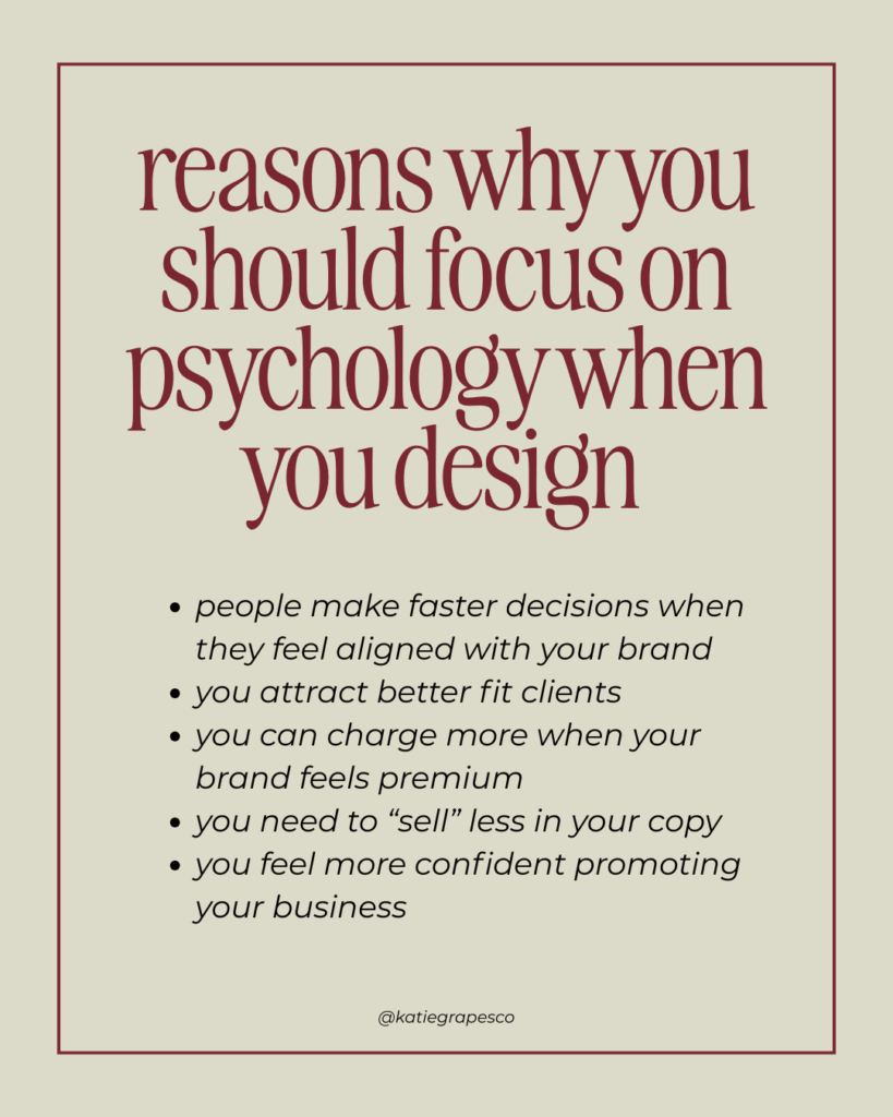
People make faster decisions when they feel aligned with your brand.
When someone lands on your website and immediately feels like “Yes, this is for me,” they’re much more likely to book a consultation, sign up for your email list, or purchase your service. They don’t need to think about it as much because it feels intuitively right.
You attract better-fit clients.
When your website’s design accurately reflects your personality and approach, you naturally repel people who wouldn’t be a good fit and attract people who would be. This means fewer nightmare clients and more dream clients.
You can charge more when your brand feels premium.
This isn’t about tricking people or being fake – it’s about making sure your design accurately reflects the quality and value of what you offer. When your website feels polished and professional, people assume your services are polished and professional too.
You need to “sell” less in your copy.
When your design is doing the emotional heavy lifting, your words don’t have to work as hard to convince people. They’re already feeling positive about you and your business before they even read your testimonials or your about page.
You feel more confident promoting your business.
When your website accurately reflects who you are and what you stand for, sharing it feels authentic and energizing instead of awkward and forced.
The Intuitive Advantage (Why Not Everything Needs to Be Calculated)
Here’s something I want to normalize: you don’t have to consciously analyze every single design choice from a psychological perspective. A lot of the best design decisions happen intuitively, when something just “feels right.”
I think the conscious understanding of design psychology is helpful because it gives you a framework for making decisions and explains why certain things work. But the actual application of it can be much more intuitive and natural.
When I’m designing, I’m not usually thinking, “Okay, now I need to choose a color that will trigger feelings of trust and security.” I’m thinking, “What color feels right for this person and this message?” And then, if someone asks me why I chose that color, I can usually explain the psychological reasoning behind it.
Trust your instincts about what feels right, and then use psychological principles to refine and optimize those instincts. The goal isn’t to turn design into a cold, calculated science. The goal is to create designs that feel authentic and aligned while also being strategically effective.
When Psychology Meets Practicality
One thing I always keep in mind is that design psychology needs to work within practical constraints. A website has to be functional before it can be psychologically effective.
That means:
- It needs to load quickly (because nobody will stick around to experience your beautiful psychology if they’re staring at a loading screen for 30 seconds)
- It needs to work on mobile devices (because most people are browsing on their phones)
- It needs to be accessible to people with different abilities
- It needs to be organized in a way that makes sense logically, not just emotionally
The psychology enhances the functionality – it doesn’t replace it. You need both the practical foundation and the psychological refinement to create a website that really works.
The Questions That Change Everything
If you want to start thinking more psychologically about your own website or brand, here are some questions that might help:
About your ideal clients:
- How do you want people to feel when they first encounter your brand?
- What emotions would need to be present for someone to feel confident about working with you?
- What might make your ideal clients feel anxious or uncertain, and how can your design address those concerns?
About your business personality:
- If your business were a person, how would you describe their personality?
- What’s the energy you bring to your work – calm and steady, energetic and inspiring, wise and reassuring?
- What do you want people to assume about you based purely on your visual presentation?
About your industry and positioning:
- Do you want to fit in with industry norms, or stand out from them?
- Are you positioning yourself as the premium option, the accessible option, or something else?
- What psychological associations do people already have with your industry, and do you want to reinforce or challenge those associations?
About emotional alignment:
- When you look at your current website, how does it make you feel?
- Do those feelings align with how you want your clients to feel when they work with you?
- If there’s a disconnect, what specific changes might create better alignment?
The Future of Design Psychology in Business
Here’s what I think is going to happen: as people become more aware of how much their digital experiences affect their well-being and decision-making, they’re going to start expecting more thoughtful, psychologically-aware design.
The businesses that understand this – that treat their websites as tools for creating positive emotional experiences, not just information delivery systems – are going to have a huge advantage.
People are craving authentic, aligned, nourishing digital experiences. They’re tired of websites that feel manipulative or overwhelming or just… soulless. They want to work with businesses that understand them as whole human beings, not just potential customers.
And that’s where design psychology becomes not just a nice-to-have, but a must-have. It’s how you create digital experiences that feel genuinely human in an increasingly digital world.
Your Website as an Extension of Your Empathy
Just like you would think carefully about how to make someone feel comfortable and understood if they were sitting in your office or your living room, you should think carefully about how to make someone feel comfortable and understood when they’re visiting your website.
What would they need to see to feel safe? What would they need to experience to feel excited? What questions are probably running through their minds, and how can your design choices help answer those questions before they even have to ask them?
When you approach web design from this perspective – as an act of empathy and understanding rather than just aesthetic decoration – everything changes. Your design choices become more intentional, more effective, and more aligned with your values as a business owner.
Ready to Speak the Secret Language?
If you’re reading this and feeling excited about the possibility of creating a website that doesn’t just look good but actually communicates the right psychological messages to your ideal clients, I want you to know: this is absolutely learnable.
You don’t need a degree in psychology (though it doesn’t hurt!). You don’t need years of design experience. You just need to start paying attention to how different design choices make you feel, and then start making more intentional choices about the feelings you want to create.
And if you’re ready to work with someone who understands both the strategic and psychological aspects of web design – someone who can help you translate your business vision into visual choices that actually support your goals – I’d love to help you make that happen.
Because here’s what I believe: your website should be doing more than just looking pretty. It should be having meaningful psychological conversations with the people you most want to serve. It should be making them feel seen, understood, and excited to work with you.
Ready to create a website that speaks the secret language of design psychology? Click the button below and let’s talk about how we can make that happen.
Your business has a unique personality, and your ideal clients have specific emotional needs. When you understand how to connect those two things through thoughtful design choices, that’s when the magic happens. That’s when your website becomes not just a marketing tool, but a genuine extension of who you are and what you stand for.
And honestly? That’s the kind of design psychology that changes everything.
9/25/2025

